Best Font for Subtitles: Size, Colour and Background for Easy Reading
The best subtitle font is a clear sans-serif at the right size with an outline or background box. Here are the settings that stay readable on any scene and screen.

Содержание
01The best fonts for subtitles02The right size03Colour and contrast04Outline, shadow or background box?05Position and timing06Setting it up in BetterStream07Recommended starting settingsGood subtitles disappear: you read them without noticing them. Bad ones fight the picture, vanish on bright scenes or are too small to read from the sofa. The font matters, but size, colour and background matter just as much.
The best fonts for subtitles
Choose a sans-serif font with open letter shapes, clear differences between similar letters (I, l and 1) and generous spacing. Good choices that are easy to find:
- Arial and Helvetica: the classic default; plain and very legible.
- Verdana and Tahoma: wide letters and spacing, excellent on small or low-resolution screens.
- Inter, Roboto and Open Sans: modern screen fonts with large letter heights.
- Atkinson Hyperlegible: designed for readers with low vision, with very distinct letter shapes.
Avoid thin, condensed, decorative or script fonts. Italics are fine for off-screen voices, not for every line.
The right size
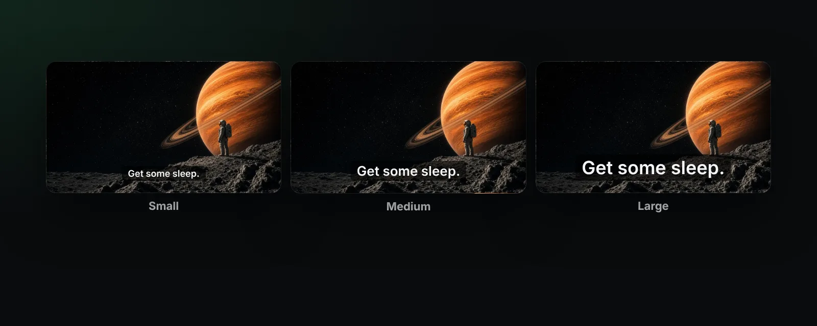
Size depends on screen and distance more than on resolution. A practical rule: the capital letters should be roughly 4 to 5 percent of the picture height. On a laptop at arm's length, medium is usually right; on a TV across the room, go large.
Keep lines short, about 37 to 42 characters, and no more than two lines at once. Long lines force the eye to travel too far.
Colour and contrast
- White text is the most readable on most scenes.
- Yellow stands out on very bright footage and is popular with older viewers.
- Pale blue or green can help separate speakers but is less legible as a default.
Whatever the colour, it needs contrast against the picture behind it, which is where outlines and boxes come in.
Outline, shadow or background box?
| Style | Pros | Cons |
|---|---|---|
| Outline or shadow | Keeps more of the picture visible | Can still disappear on busy, bright scenes |
| Semi-transparent box | Readable on every scene | Covers part of the picture |
| Solid black box | Maximum contrast, classic caption look | Covers the most |
If you often miss lines on bright scenes, a semi-transparent box is the most reliable choice.
Position and timing
Subtitles belong at the bottom centre, slightly above the edge. Move them up only when they cover on-screen text. Each line should stay long enough to read twice comfortably; if lines flash past or appear early, fix the timing (see how to sync subtitles).
Setting it up in BetterStream
In BetterStream you change subtitles while the video plays:
- Open the subtitles menu and choose Style.
- Pick a size: small, medium or large.
- Pick a colour: white, yellow or blue.
- Pick a background: none, shadow or box.
You see the result immediately, and BetterStream remembers your choice for every video, whether the subtitles come with the stream or from your own SRT, VTT or ASS file. Not sure which track to choose? Read subtitles vs closed captions.
Recommended starting settings
- Laptop or desktop: medium, white, shadow.
- TV or projector: large, white, semi-transparent box.
- Very bright content, or low vision: large, yellow, box.
Frequently asked questions
What is the most readable subtitle font?
A clear sans-serif such as Arial, Verdana or Atkinson Hyperlegible, used with an outline or background box.
What colour should subtitles be?
White for most viewing; yellow when scenes are very bright or for viewers who find white hard to see.
How big should subtitles be?
Capital letters around 4 to 5 percent of the picture height, larger when you sit far from the screen.
Can I change the subtitle font in a subtitle file?
SRT files do not set fonts; the player decides. ASS files can, but most players let you override them.
More in the help center.